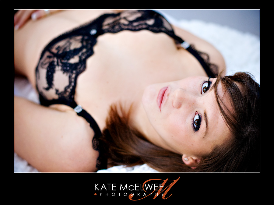
A couple of weeks ago, I had a super-fun extended boudoir session with the gorgeous and totally sexy Miss K. I’d been looking forward to photographing her since she first expressed interest, which must have been over a year ago (we used to work together in fact, back in my waitressing days). We ended up with a ton of cute photos and I’m excited to be making a sample album of her session in the new year – watch this space! As well as the regular soft white photos in my boudoir studio, we played around with some studio lighting for a darker, more mysterious look. I’d love to know what you all think!
As usual with boudoir teasers, the content below is not safe for work, and includes some nudity. Enjoy!

© 2008 Kate McElwee Photography

(Yikes! For some reason, when I tried to comment the first time, I put it onto the wrong blog – sorry! As Homer Simpson might say . . . ”D’oh!!”)
I was going to say that I think all of these are wonderful, and that I especially like the ”darker” ones.
As Homer Simpson might say . . . ”D’oh!!”
Outstanding shots. You have a great model to work with. The poses and lighting are fabulous. Well done.
First, she is gorgeous!!! No doubt about it. Second, you did such an amazing job photographing her:) Its making me very excited to see you in a few weeks!!
Kate,
WOW! Now, those are gorgeous! Make me want to do some myself, and Chris wants me to get them done…go figure!
You are SO talented! Great Job! Dark ones are AWESOME!
beautiful model. you guys look like you had some fun. if only. do you know how to photograph men?
My favorite of the set is one of the dark ones, where she has a shirt on, and is looking away from the camera. It still looks a little bit ‘fashion’ ish but it feels more spontaneous than the others.
I like the low key shots, they are different. But the lighting and angles look kind of the same as the high-key shots.
What comes to my mind are:
1) a wider lens, i.e. work closer. Yeah, I know, these are supposed to be pretty, not artsy fartsy, but I’ve been surprised with what I get. The model look is nice and the 200mm is easy, but I think things will look a little more spontaneous and the images will have more presence and intimacy if you work a little closer. With a dark background you can use angles that normally would include lots of background, too.
2) back/rim light. Most of your shots have this beautiful side soft light, which is great for ninety percent. It’s getting boring. Mess with it. I dunno, I would add a single, small, direct light from behind (I know there might be some space issues, but just take a SB800 and turn it way down). Or use a direct light as the main light, and turn the soft way down, making it into a realy subtle fill (add a little warmth with a gel, perhaps). Too much rim will get a centerfold effect (you know specifically I am talking about) but it can be used quite subtly as well – add a glow here, a glint there, or just open up a shot.
heh, happy new year, permy.
🙂
Fred
Very nice. Great facial structure (those cheekbones and the way her smile curves at the ends = wonderful). It looks like you were having fun. Not that I can offer advice, but if I were asked, I would look for some different expressions: maybe it’s a guy thing but that subtly bitten lip works really well for Miss K. I think the lighting and depth of field are well chosen, it lets the model shine through without the appearance of being over-done.
You’re good at this, you know?
LOVE LOVE LOVE the dramatic lighting Kate!!! This is a great session, you rocked it and she’s so gorgeous! 🙂
gorgeous!!! love the use of your choco wall. so intimate.
Smokin’ hot! Great shots! My faves are definitely the middle, darker ones. Especially the B/W with her opening her shirt – that’s magazine material. Great job!
And she was all worried that they wouldn’t turn out well. Pshaw! I kept telling her – trust Kate! She’s magical. And, of course, you didn’t disappoint. These are all stunning, my dear! Can’t wait until our next session when I’ve got a big ol’ belly! :)~